Monday, April 28, 2014

Facebook still unstoppable as it grows to 390 million active users in Asia

The Zuck doesn’t come unstuck. Facebook (NASDAQ:FB) is continuing its march across Asia, as seen in the Q1 2014 earnings report for Mark Zuckerberg’s social network. Facebook now has 390 million monthly active users (MAUs) in Asia, from a grand total of 1.276 billion around the world. That Asia tally is up from 368 million MAUs at the end of last year – and way up from 319 million in Q1 2013. Note that when Facebook issues its Q2 figures, Asia will be the bigger than the ‘rest of the world’ segment. Here’s the MAUs chart for Q1:

Allied with Facebook-owned WhatsApp and its 500 million monthly active users, the social network has an extraordinary global army of engaged users. Here’s are Facebook’s Q1 figures for daily active users. There are now 216 million of them in Asia:
Revenue from Asia: The ‘Asia’ chunk of the charts gets a lot slimmer when it comes to revenue. Facebook made $354 million in revenue from Asia out of its total of $2.5 billion in Q1, which is 14.14 percent. Facebook’s revenue dipped from Q4 last year to the most recent Q1, and Asia managed to bring in the only regional revenue rise in that time period.


Facebook makes $0.93 per user in Asia – that’s its ARPU – but that’s below the global average of $2 per user.

Read more: Facebook still unstoppable as it grows to 390 million active users in Asia http://www.techinasia.com/facebook-390-million-monthly-active-users-asia-q1-2014/

Why Your Bad Facebook Marketing Strategies are Ruining Ad Targeting

You get all of your friends to like your page. You buy likes. You run around liking pages, leaving messages on their timelines to like you back. You join in on Fan Page Friday, listing your page so that you can be liked. You pay for really cheap likes in irrelevant countries (bots) that don’t lead to business.
You do this all for a number. Because you think it’s important to build that social proof. Or the mirage of social proof.
And to a point, you’re right. I’m more likely to take your page seriously if you have 5,000 instead of 5 likes. After that, you need to provide value.
So… no big deal, right? Doesn’t hurt anyone?
Wrong. Your crappy strategies are ruining ad targeting for the rest of us. As a result, two things happen:
  1. We target people in ads who couldn’t care less about our product or service; and
  2. We end up with your sorry bot fans liking our page.
Let’s break down how this happens…

Hey! We’re Not Big Enough!

Your boss comes to you with a problem, and he/she isn’t happy.
“[Company X] has 50,000 likes! People love them! They are making tons of money! They are doing Facebook right! We have only 58 likes! How can we be more like [Company X]?”
Your boss actually has no idea whether Company X is making tons of money or that people love them. But the perception exists that this is the case.
And, hell… Your page has only 58 likes! So you’re doing something wrong.
You start obsessing over Company X. You aren’t going to buy likes. You aren’t going to swap likes with people who don’t care about your brand. You’re going to do it the right way.
So you ask for an ad budget…

You Create Ads

You’re given a hefty monthly budget of $3,000. You use that with the goals of increasing likes and engagement. So you create Page Like ads and you promote posts.
You’re doing it the right way. You listen to me, and you follow my instructions precisely. You care more about quality than quantity (but you need to get to that 50,000!).
So when you create that highly targeted Page Like ad, you make sure to only target Company X in the interests. After all, they are your biggest competitor. They offer a very similar product. If a person likes Company X, they’re bound to care about your brand, too!
And then this happens…

All Hell Breaks Loose

You get new likes. In fact, they’re cheaper than you expected. Your boss is happy.
But something doesn’t feel right.
The engagement you’re getting is worthless. Comments on your post include spam and nonsense. And the few real people who comment on your posts are angry that you’re in their News Feed.
Why are they angry? This is a highly targeted audience. Your product or service should be relevant to them.

Targeting is Only as Good as the Quality of the People You’re Targeting

This is the big issue with targeting on Facebook. If you’re going to target the audience of a particular page, for example, you’re putting faith in that brand for building their audience the right way.
But maybe they didn’t. Or maybe they did, but they targeted another brand they respect that wasn’t doing it the right way. It’s easy to pollute targeting with one sleazy advertiser.
While interest targeting can be highly effective, this is a major hole. It’s why you should first focus on Custom Audience (customer email list) targeting and FBX (website retargeting). In these cases, you have much more control over the quality of your audience.

Do it the Right Way — For Us

I know you want more fans. I know you have pressure to grow. But the more sleazy marketers are out there, the more targeting is watered down. Eventually, we’re just targeting a bunch of bots and people who liked random pages as favors.
A good way to test the quality of another brand’s audience is by promoting something that leads to a registration or purchase. It tends to be much more difficult to get sales out of non-fans, but if you can get some initial registrations or sales out of this group, you are on the right path.
Even if you don’t use such a strategy, be smart. Don’t buy likes. Don’t swap likes. Don’t ask people who have no interest in your brand to like your page. Your goal is to build a highly relevant audience that is likely to buy from you.

“I Never See Ads that are Relevant to Me!”

This obsessive like-building makes things tougher for the good marketers, but it also ruins things for users.
I’m sure you’ve heard the complaint a million times. “I never see ads that are relevant to me!” Well, part of that is bad marketing. But the other part is likely your own fault.
Do you like a friend’s page because he asked you to do it? Are you exchanging likes with other pages to help build your own?
When that happens, you confuse the hell out of Facebook. Facebook’s trying really hard to understand who you are and what you like. When you start liking things you don’t actually like? That’s a bit of a curveball.
So, you’re right. You aren’t seeing relevant ads from brands you care about. Because Facebook can’t read your mind and you’re sending them the wrong signals.
If you want to make Facebook the best possible experience for yourself as a user — and even be served ads that you care about — start telling Facebook what you actually want to see.

Your Turn

What strategies do you use to target your most relevant audience?

Monday, April 21, 2014

5 Mistakes Businesses Make with their Website Home Page

What makes a great website home page?  Ask five people and you likely will get five different answers.
As I talk with businesses wanting to improve their online performance of growing leads and converting sales, I often find that what they THINK should be on the home page and WHAT ACTUALLY SHOULD BE are two very different things!

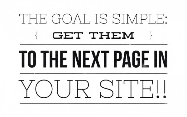
The goal of the home page really is quite simple.  It’s to get them to the next page in your website!

Get them to the Next Page 600x375 5 Mistakes Businesses Make with their Website Home Page
If someone comes to your home page and leaves, you’ve really failed.
Getting them to a second page means you’ve gotten them interested and they are ready to dig in further.  Without this, it means they’ve glanced and moved on, and it’s much harder to get them to come back a second time!
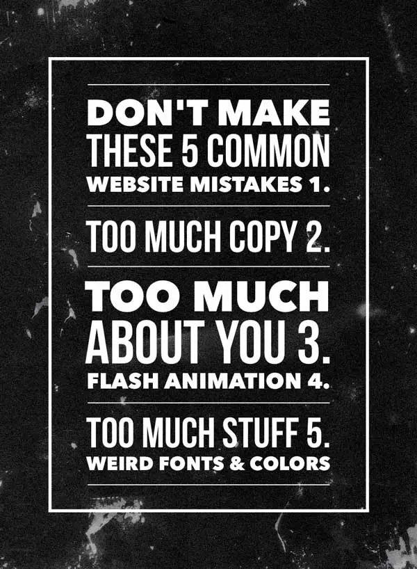
The web is cluttered with information and people are busy.  Therefore you have little time and you need to make the most of it.  You have that one chance to make a great first impression!  The issue is that far to many website home pages are failing and here are the five most common mistakes businesses make:
5 common mistakes on websites infographic 5 Mistakes Businesses Make with their Website Home Page

Mistake Number One: 

Too much copy. 
Words, words, and more words cause home pages to fail.
As I noted, people are busy and they are skimming.  Lines of text that you think are glamorous and explain all that you do simply blur together into a mass of letters to the skimming eye!  Businesses must really boil it down on the home page and keep it simple.

Mistake Number Two: 

Headlines and copy about your stuff. 
Jay Baer, a noted author and digital media consultant outlines in his book, Youtility, that people are on the web for generally only two reasons.  Either to solve a problem or to be entertained.  They use social media for entertainment so they are coming to your website to see if you can solve their problem.
The solution, therefore, is to answer how you solve the problem they have.  It’s not about you, your products or services, but about them.  A great home page outlines the problems your company solves.

Mistake Number Three:

Flash animation. 
Animation that requires the browser to have and use a flash player to perform groovy animation and a sequential series of images fading in and out is not helpful.  Why?  Many devices like Apple products including iPhones and iPads do not support flash and therefore visitors on those devices typically get a blank screen or blank area, or worse yet a big red “x”.
Again, too much animation is too many moving parts.  Keep it simple.
You’ve got about 3-4 seconds to capture the attention of the visitor and communicate to them that you can help them with what they need.

Mistake Number Four: 

Too many points of interest. 
Loads of navigation buttons, competing images, and paragraphs of text all serve to cause viewers to see a dense forest and miss the individual trees!  Again, people are moving fast on the web and you have precious seconds to capture their attention and communicate to them.
Give them your one best thing, not the top eight categories and also the five sub-categories you offer because they’ll see only one or maybe two of those items before they move on!

Mistake Number Five:

Bad colors and weird fonts.
Have you noticed a theme?  Less is more.
They have a problem, you need to share how you solve it.
Fancy fonts can be hard to decipher and even worse to discern on mobile devices.  As well, dark backgrounds with lots of small white text are great if you are in a dark room and have a magnifying glass but that’s not your everyday web visitor!  What’s the default background in Microsoft Word?  White, with a simple font.  That’s done for a reason.
I could go on with a few more points but I’ll bring it to a close to allow you to reflect on your site in relation to these key points.
Take a fresh look at your company and competitor websites soon and see how things rate.
What’s your next doable action step you should take?  Do something in the next 24 hours and let me know what you do!

Thursday, April 17, 2014

The Anatomy of a $122.5 Million Venture-Funded Ecommerce Website

How do you get more sales and repeat customers for your ecommerce business?
That’s the number one question most online store owners want answered. Most of the time, it comes down to making small improvements and optimizations to your site over time.
But where do you start? 
To give you some ideas and inspiration, we decided to take a look at Harry's, a 12-month old ecommerce business powered by $122.5M in venture capital funding. Harry's sells razors and grooming products for men and was founded by Jeffrey Raider and Andy Katz-Mayfield. Raider was one of the cofounders behind Warby Parker, the popular ecommerce service for eyeglasses founded in 2010 and currently rumored to be valued at around $500 million.
Surely with all that money and experience they must be doing something right.
Let's find out :) 

The Homepage

The design of the Harry's website is clean and uncluttered. It's a simple but effective aesthetic that's built around excellent product photography.
Having an attractive ecommerce website with high quality photos is important because it helps to make your products appear more valuable and helps your business appear more trustworthy. Remember, people can't touch and feel your products in an online buying environment like they can in a physical retail location so you need to make sure you're showcasing your products in the best possible light – something Harry's does particularly well. 
The Harry's website is also mobile responsive and looks great on any device – something that's now mission critical for online stores. In fact, a recent survey found that 83% of global shoppers who use mobile devices plan to make a mobile purchase in the coming year. To make sure your website looks sharp and is optimized for all screen sizes, consider investing in a premium mobile responsive theme or hiring an ecommerce web designer
On previous visits to the Harry's site, they were using a carousel that displayed a rotating selection of hero photos which showcased a mix of products and information about the company. At the time of this writing, the carousel is no longer being used and they're instead employing a static hero image. This could be something they're A/B testing or it could just be that they no longer wish to highlight certain products and information as prominently anymore.  
In any case, large hero images are definitely "in" right now and are typically used to display lifestyle photos featuring the product in action. If you decide to use a carousel on your site, make sure you test it as they've been shown to reduce conversion rates.  
If we continue down the Harry's homepage, we can see they've chosen to display their flagship products followed by a selection of content including their online magazine, pop-up shop and manufacturing story.  Making sure you tell your story on your website and communicating what makes your business unique and remarkable is more important than ever with Amazon a click away. 
Finally, in the footer there are some important trust-boosting elements including links to email and phone support as well as social media profiles.    

The Product Page

The Harry's product page is exceptionally well done. Studies show that larger product images can increase online sales by up to 9% and Harry's takes full advantage. 
Their free shipping offer is easy to spot and their add to cart button is prominent and obvious. Offering your customers free shipping can be an effective way to improve conversions on your site – especially when you consider that shipping and handling fees have been shown to be the number one factordriving shopping cart abandonment
Harry's product descriptions are relatively brief but they bolster them by beautifully presenting more information about the product's features below the fold. In addition, they do an excellent job of communicating their "quality and craftsmanship story" by offering a look into their factory. 

Confirmation / Success / Thank You Page

Every step of the buying process is a chance to impress your customers, build customer loyalty and showcase the voice of your brand. In other words, don't neglect the transactional elements of your website like your order confirmation page.
Harry's put this page to use by including the following:
  • Customer order information
  • Delivery information
  • Customer support information
  • Brand personality
  • Social media links
  • A customer survey
This is a nice mix of elements that make their customers feel confident about their purchase while at the same time helping Harry's improve their business by gathering customer feedback.  
Other things you could consider presenting on this page include:
  • Cross selling other products
  • Newsletter sign-up
  • Resources on how to use your product
  • Request for a product review
Take a look at every page on your site that your customer is required to interact with and ask yourself how you can improve it. 

Order Confirmation Email

When most online retailers think about email marketing, they often just think about sending monthly newsletters or information about sales. However, your transactional emails are just as important as your transactional website pages.
In fact, every email you send to a potential, current, or former customer is an opportunity to provide value and have a sales conversation. 

Customer Lifetime Value Optimization

A month or so after I made my purchase with Harry's, they sent me the above email asking if I needed more blades. This is a great example of how to increase the lifetime value of your customer. If you sell a consumable, anticipate when your typical customer will run out of your product and then get in touch with them. If you don't sell a consumable, figure out other offers and products that you can build into your business. 
This is something that can be automated with email marketing software. Increasing customer lifetime value is one of the best things you can do for your business. 

What's Missing? 

There's no question Harry's is doing a lot of things right. But there's always room for improvement. Below are some opportunities and tactics Harry's are not taking advantage of that could help them boost conversion. Harry's may be aware of these opportunities and are simply choosing not to deploy them because they're not "on brand" or for other reasons.

User Generated Images

Professional product photos are great. But what they don't do is actually prove that people are buying and using your product. That's where user generated product photos come in.
A new study recently found that putting user-generated image content into the context of ecommerce is a big opportunity for brands. According to the research, brands experience a 5 to 7 percent increase in conversion rate and a 2 percent increase in average order value when they incorporate, or link to, user-generated content on product pages.
Check out how Black Milk Clothing incorporates Instagram photos from their customers on their site.
If this is something you want to test on your own site, check out the Instagration app

Reviews and Testimonials

When it comes to making buying decisions online, customer reviews and testimonials can be the deciding factor that make or break a sale. Displaying positive feedback from your customers on your website demonstrates that you have existing sales and provides social proof for potential customers who are thinking about buying from you.
In fact, word-of-mouth is the primary factor behind 20 to 50 percent of all purchases, while 63 percent of online customers say they're more likely to buy on sites with positive reviews. Harry's currently doesn't display customer testimonials but it might be something for them to consider as a newer ecommerce brand. 

Abandoned Cart Emails

The most surprising thing about the Harry's shopping experience is that they don't send abandoned cart emails to shoppers who've exited the site right before buying. Considering that studies have shown as many as 67.45% of online shopping carts are abandoned, this is a big missed opportunity for them.
If you’re on the Shopify Professional or Unlimited plans, you can find out how to set up abandoned checkout recovery emails here.
In addition, there are several well-reviewed apps that can give you other sorts of functionality.
If you’re not on Shopify, you still have options. These include:

Summary

All in all, Harry's is setting the ecommerce bar pretty high. Their website provides lots to draw inspiration from if you're looking to improve and optimize your own website and buying experience.
Let us know in the comments if you plan to implement any of the ideas in this post.